"Having Trouble"
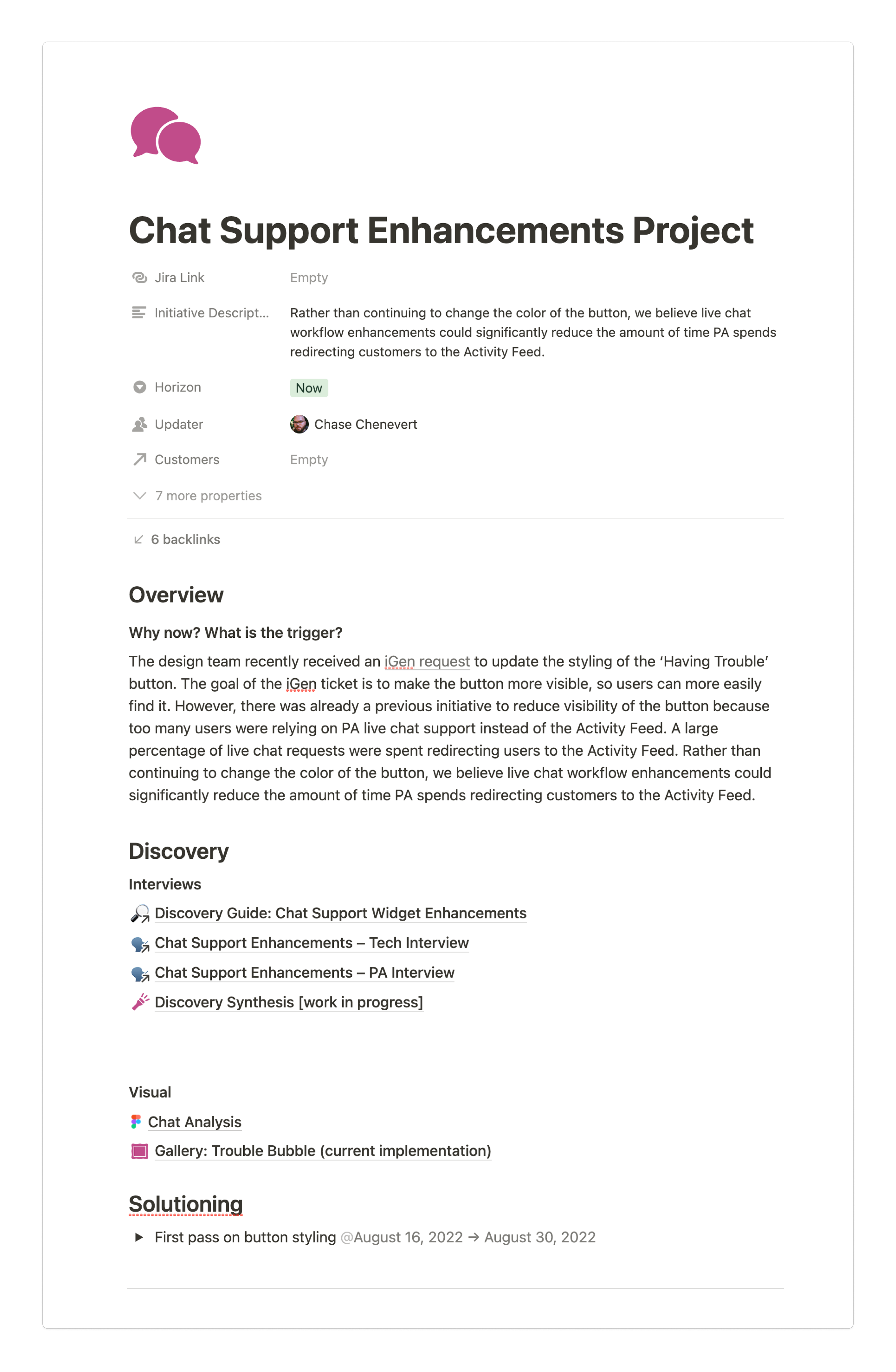
The design team received a request to redesign the support button located across the platform. The assumption was that the redesign would reduce user redirecting for the patient advocacy team.
"Buttons"
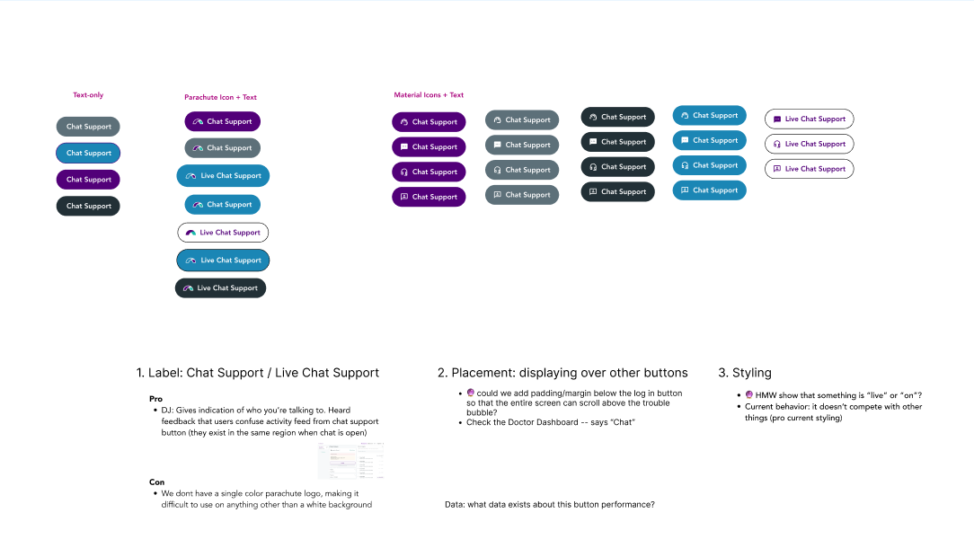
I quickly designed some buttons using the Parachute health logo and then began collecting feedback from my team of designers and internal stakeholders. During this process, we found out that the "having trouble" button had been redesigned in the past and had not resolved the issue.
"The Break Down"
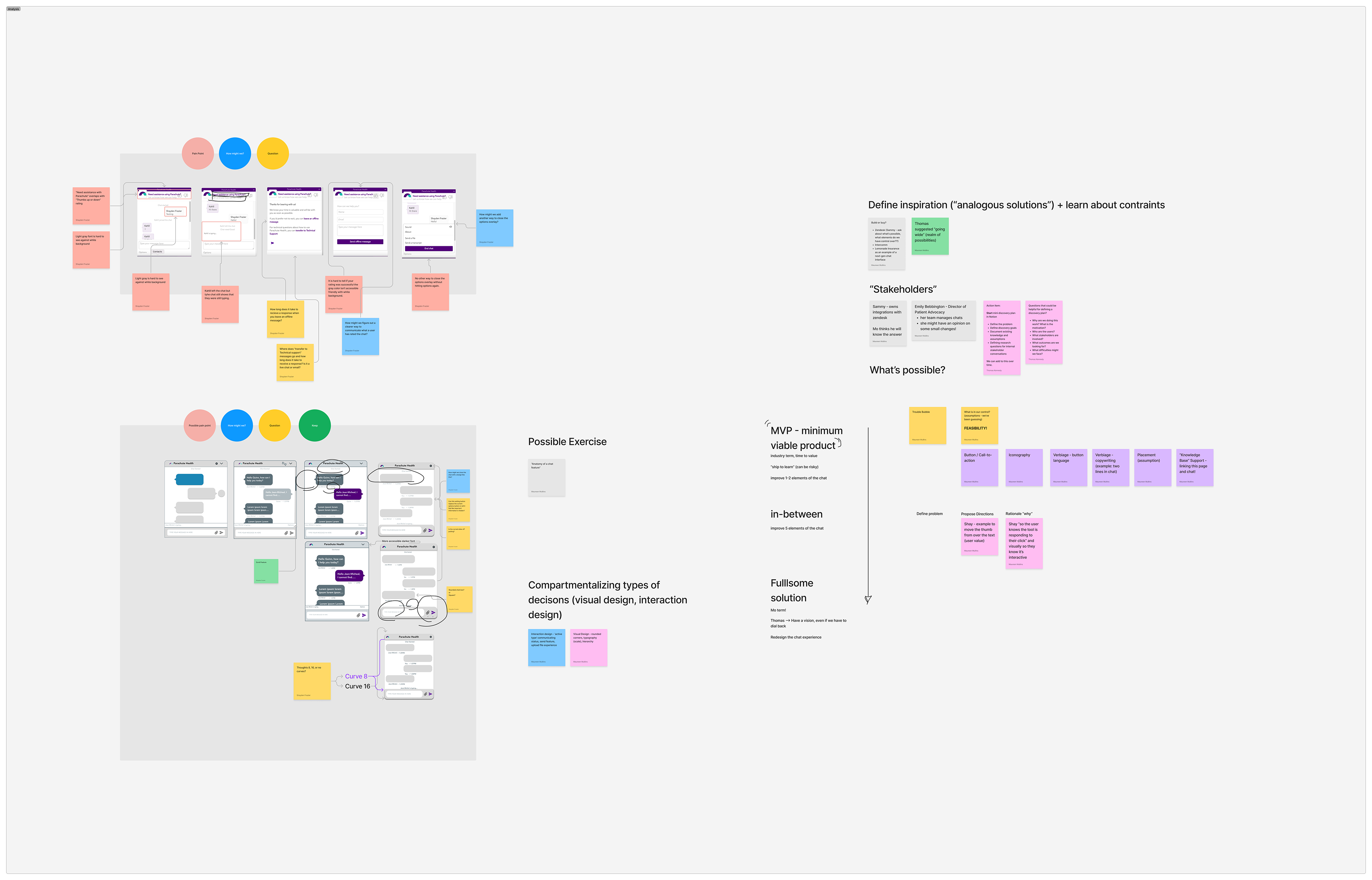
Since the previous button redesign had not resolved the issue of PA having to redirect users, I was tasked with looking into the chat application to find possible user pain points. I decided to deconstruct the app in Figma to better communicate across teams and collaborate for feedback. A senior designer requested that I do some quick iterations on possible improvements to the application.
"Journey"
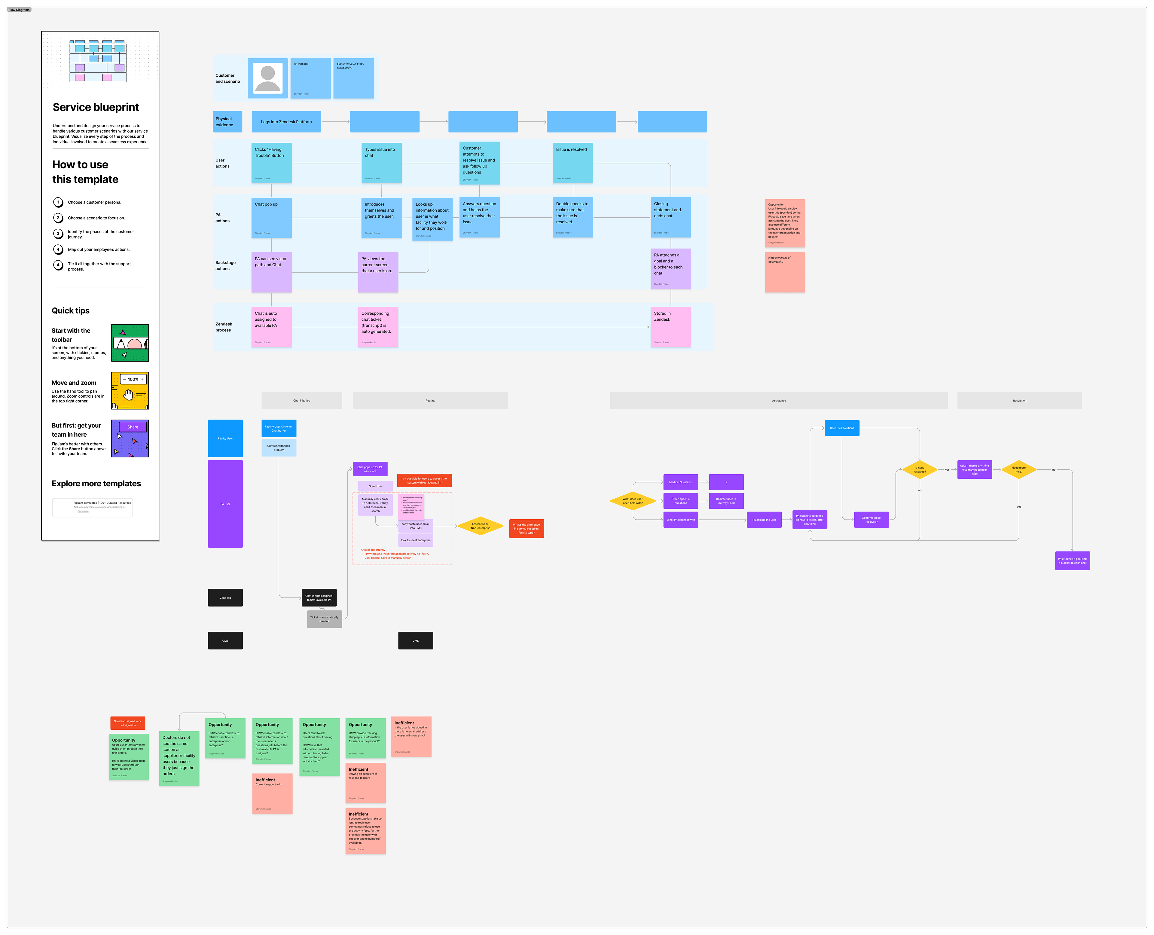
After breaking down the chat application and receiving feedback from senior designers and managers we moved forward with interviews. I lead interviews with three internal stakeholders and created a service journey map to visually represent PA's incoming and closing chat support process in order to find pain points and solutions.
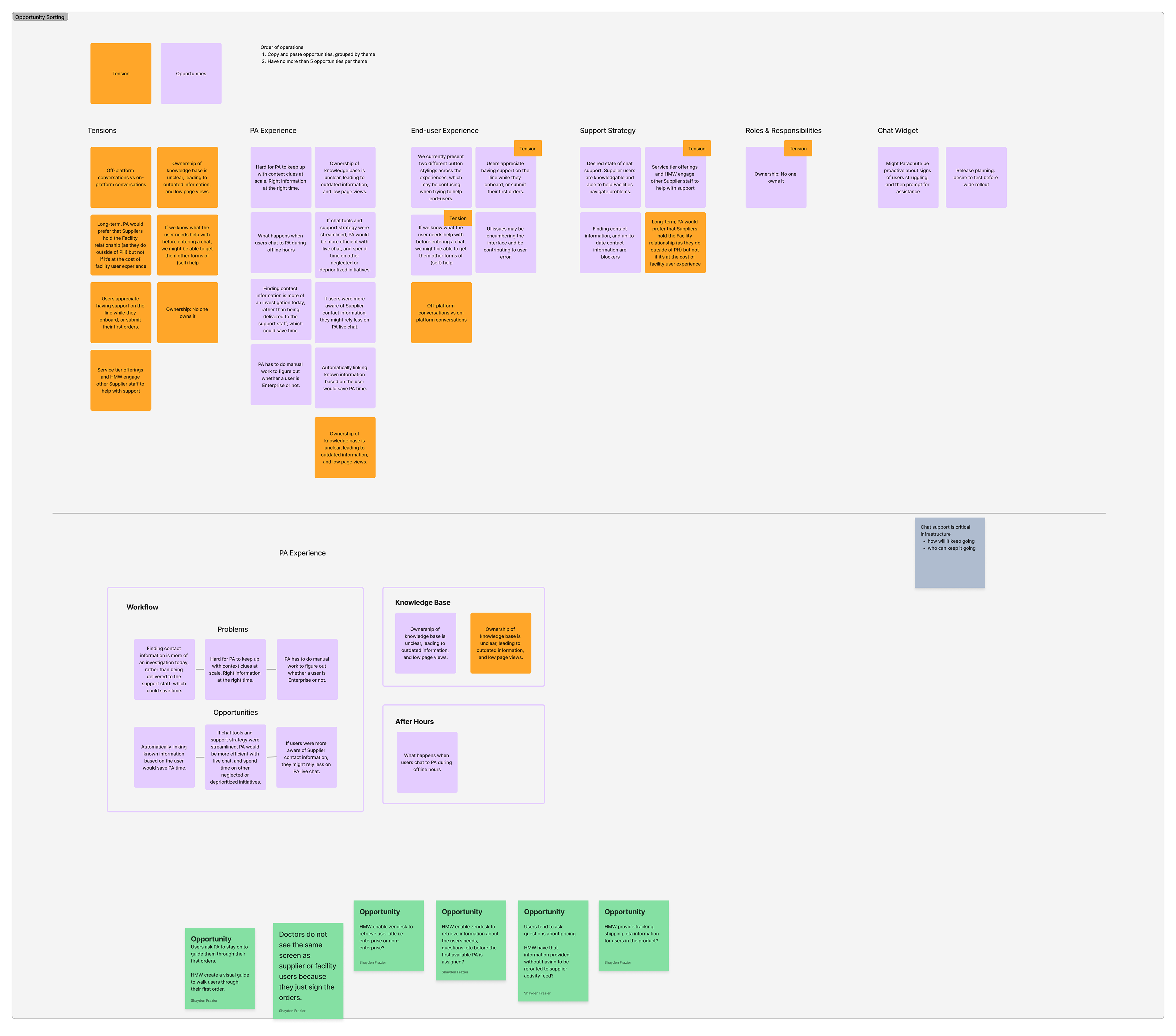
"Synthesis"
I worked with my manager to synthesize the data. We organized all of the information found during the interview and categorized it in order to determine the minimum viable product.
"Ideation"
Based on our findings we began to ideate possible solutions to user pain points. We found that users were not aware that they had received a response to their problem in the chat application and that there were some icon overlaps that might prevent users from giving accurate feedback on their experience.
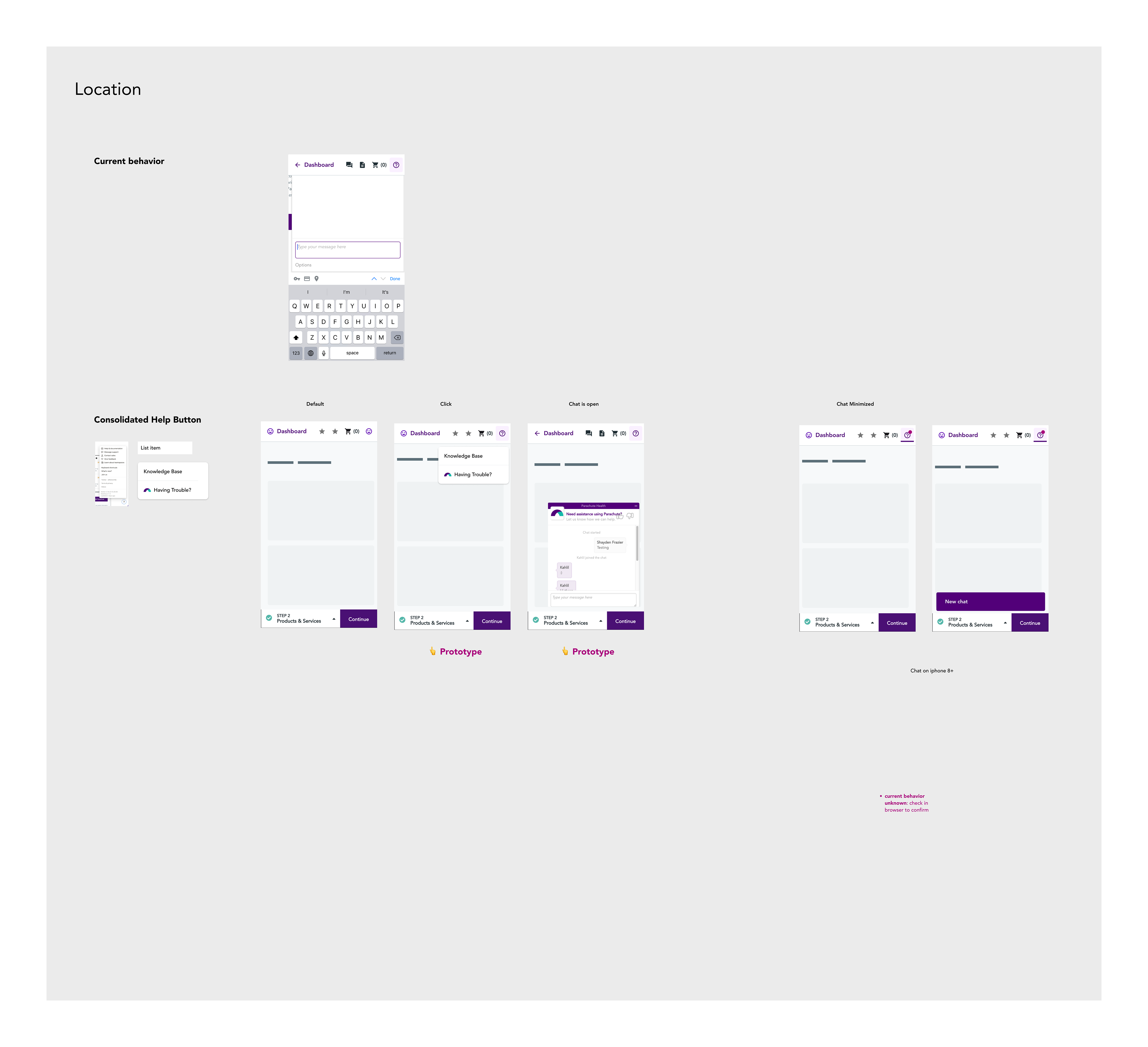
"Mock-ups"
I created mock-ups in Figma based on possible solutions from our ideation process. These mock-ups are using an iPhone SE frame because this may be the smallest device used on our platform. I wanted to make sure that the chat application was accessible to all users regardless of device size and that it did not block other features on the Parachute platform while in use.
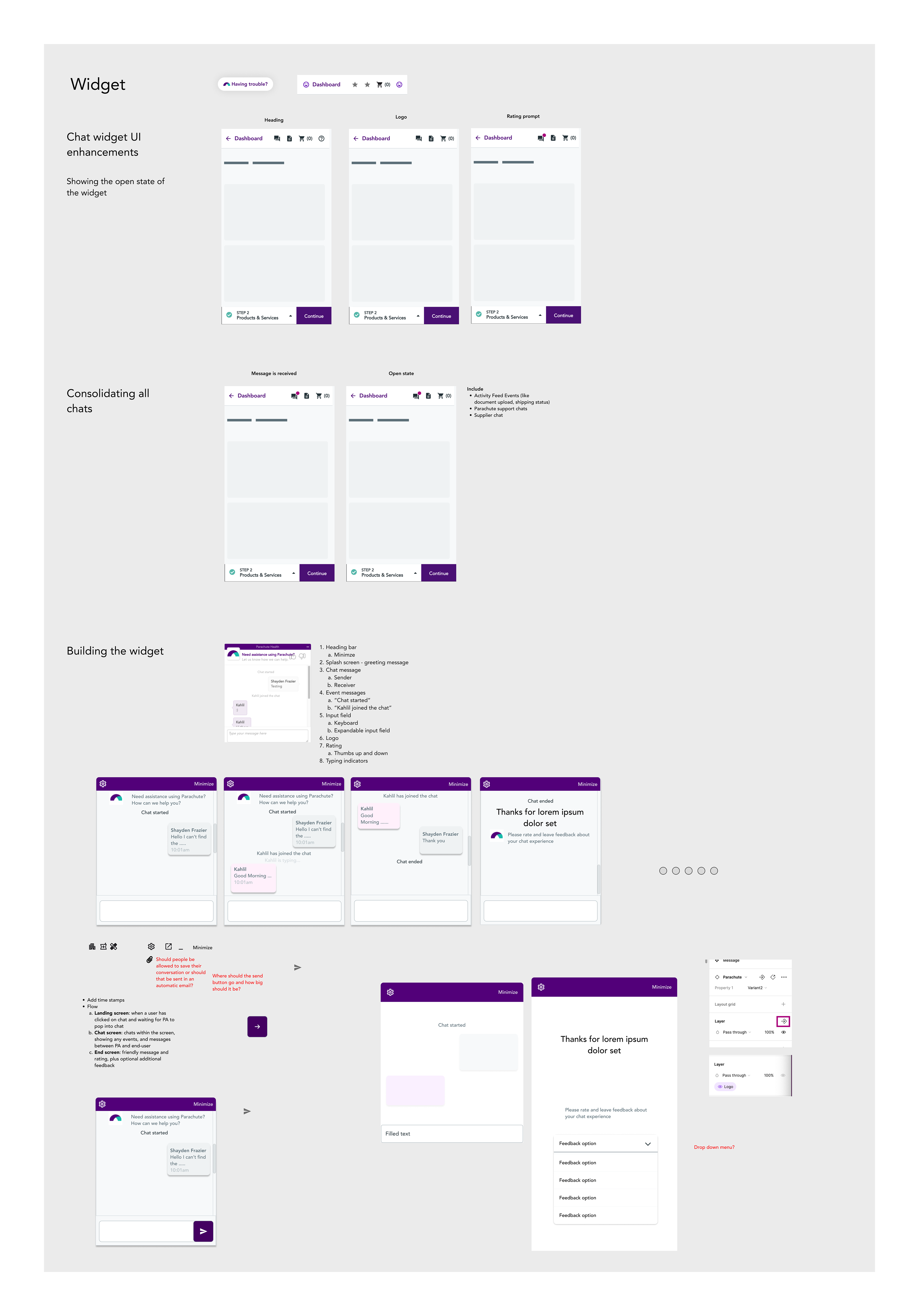
"Mock-ups continued"
Every stage of the chat process needs to be redesigned including how users leave feedback. This mock-up screen creates a new page that allows users to leave more detailed feedback instead of just a thumbs up or down. The thumbs up or down did not communicate if they liked the service, had their issue resolved, or if they were a bug in the chat application. More details will help to keep the application serving the users in the way that best suits their needs.
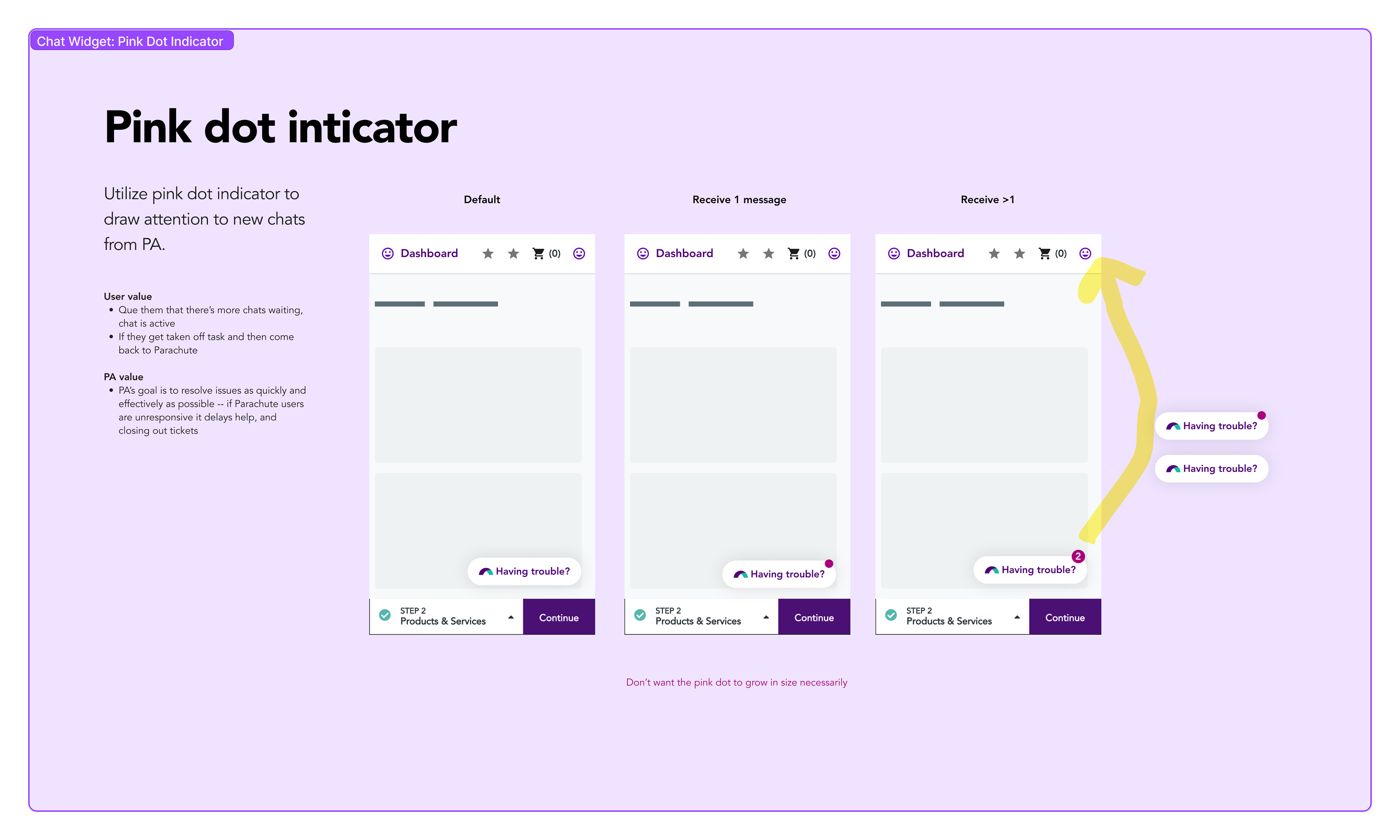
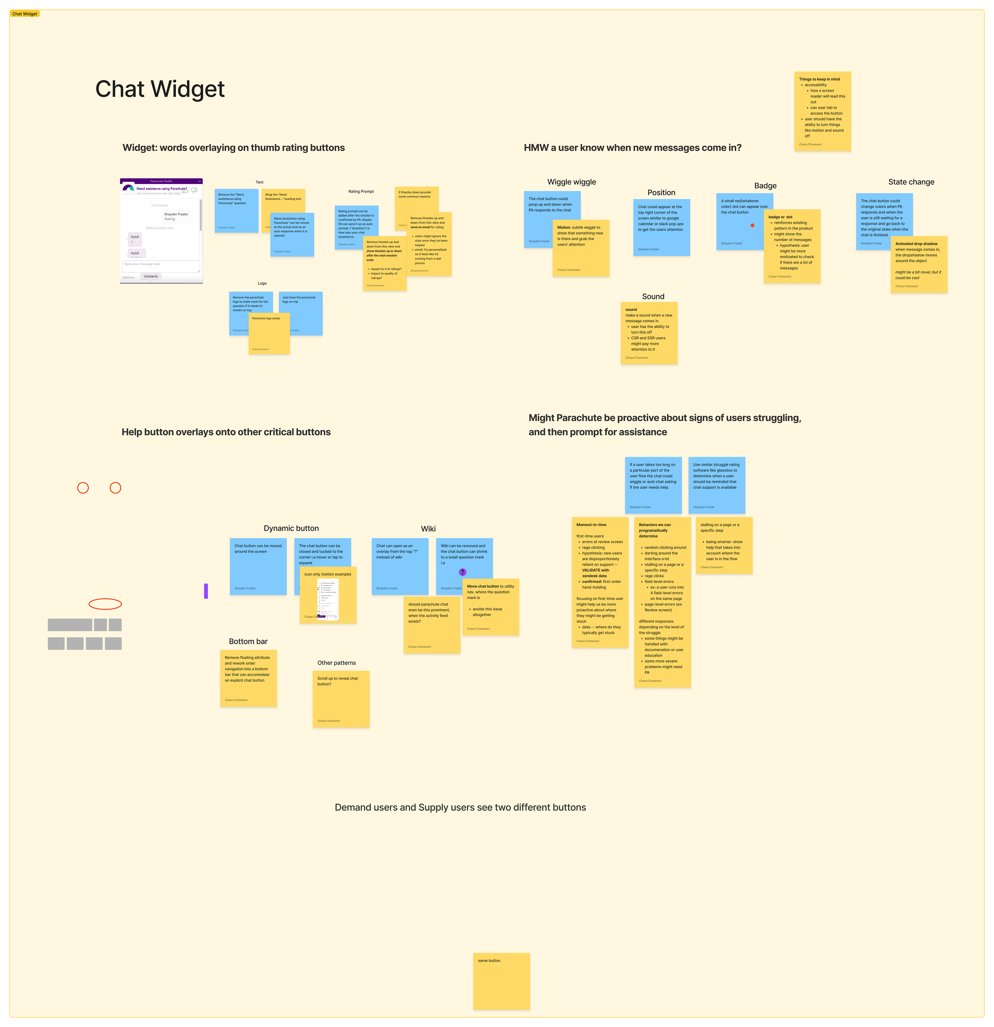
"Pink Dot"
During the ideation phase, we created an indicator in the form of a dot that appears when a message is waiting. When more than one message is waiting a small number will show in the pink dot to signify to the user the patient advocacy team has responded with a solution to their issue.
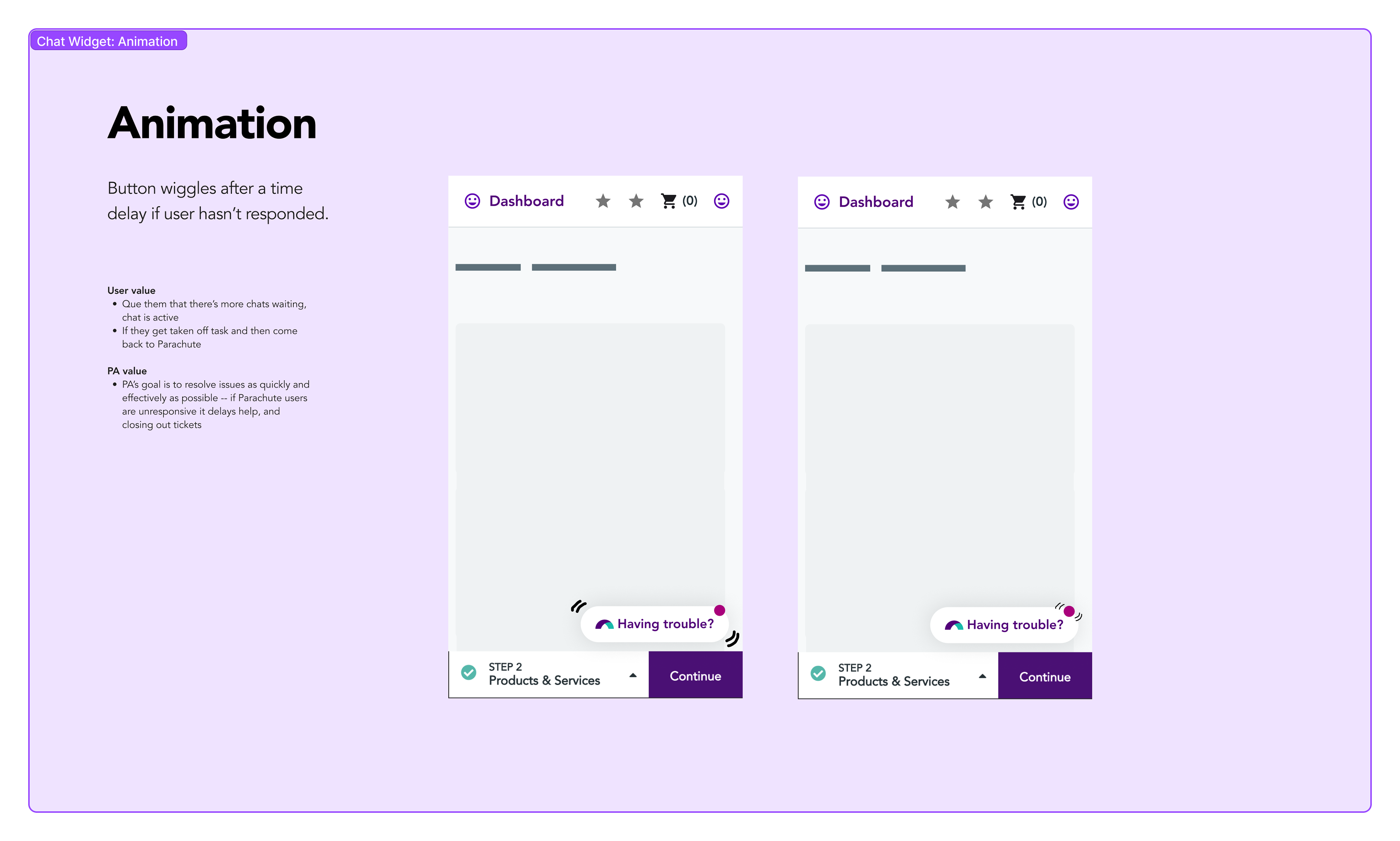
"Wiggle Wiggle"
Looking at the same screen for hours can create a form of blindness. Animation can help to get the user's attention. Combing the state change of the pink dot as well as animation that meets accessibility standards can help to inform the user and speed up the process for the Patient Advocacy team.